Luxora
Premium real estate discovery, editorial presentation & live exploration
Luxora is a luxury real estate experience: hero property storytelling, swipeable discovery, refined search and filters, and advisor-led calls to action. The site layers editorial narrative (projects, regions, how it works) with proof (metrics, testimonials) and closes with clear tour and contact paths, built to feel premium on desktop and readable on mobile.
View live siteOverview
Luxora is positioned as a premium Australian luxury property experience, not a generic listings grid. The homepage opens with a cinematic hero: strong typography, a headline that sets expectations (“Benchmark of excellence”), and a featured residence that anchors credibility before users scroll.
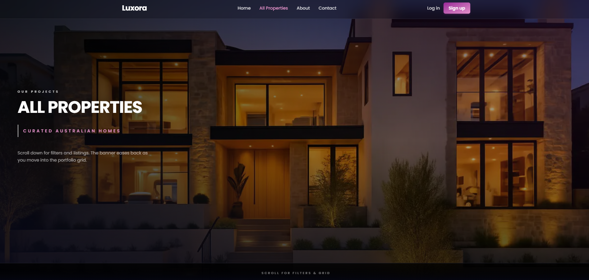
Navigation is deliberately simple (Home, All Properties, About, Contact) with clear auth entry points (Log in / Sign up) so repeat visitors and advisors can move quickly without hunting through menus. Secondary cues such as “Drag” / “Swipe to explore” reinforce that discovery is interactive, not passive scrolling.
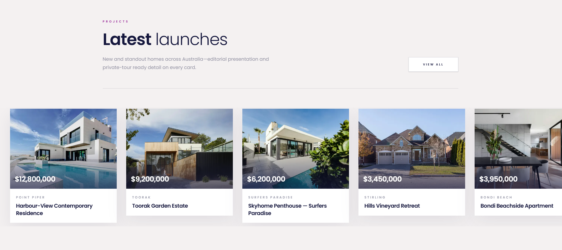
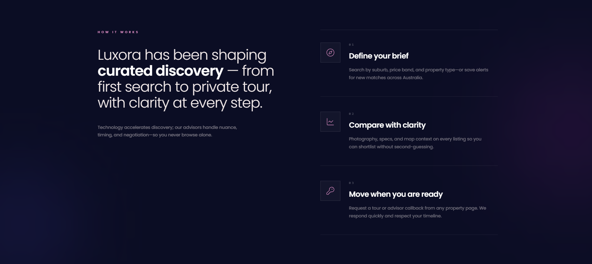
Below the fold, the product story unfolds in layers: a concise positioning statement, search with “more filters” for price and property type, a projects section that frames scale and geography, and a “Latest launches” grid that behaves like editorial cards rather than database rows. A dedicated “How it works” sequence walks buyers from defining a brief through comparison to booking a private tour, reducing anxiety for high-intent visitors who are not ready to call immediately.
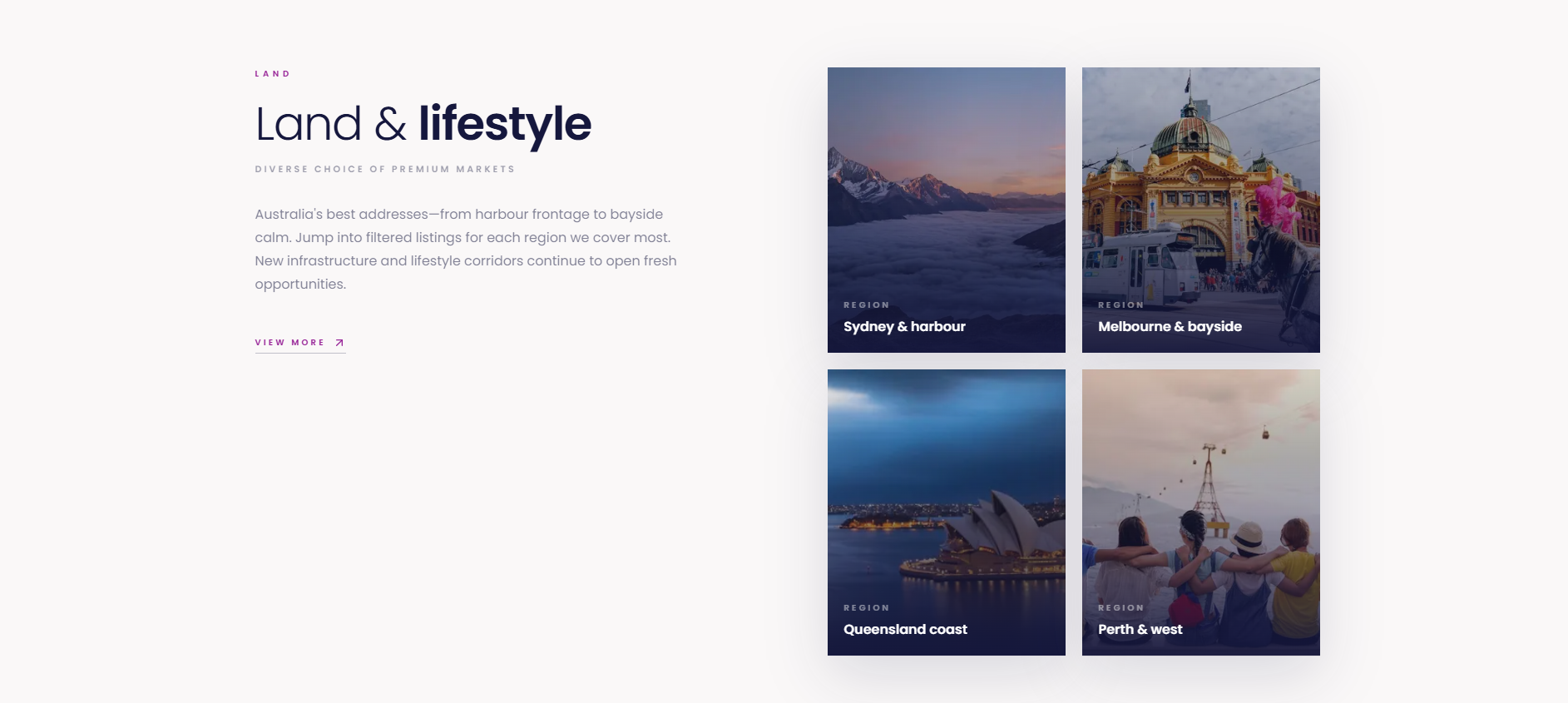
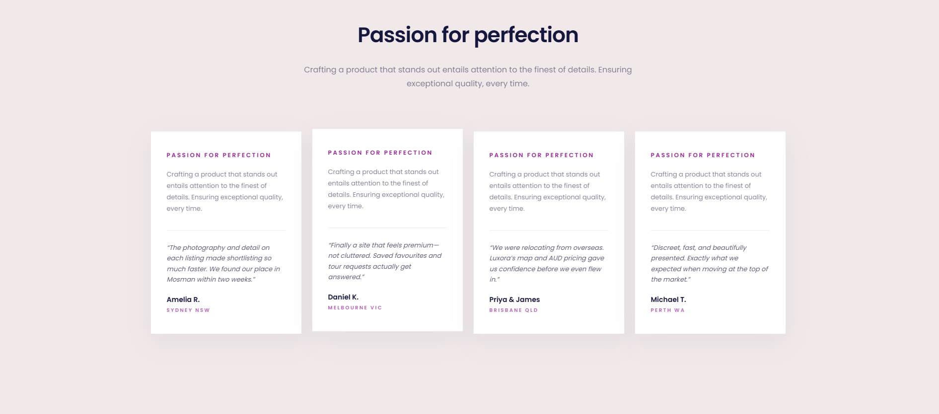
Regional “Land & lifestyle” blocks extend the narrative beyond a single city, signalling coverage across Sydney, Melbourne, Queensland, Perth, and adjacent premium corridors. Social proof appears through testimonial cards with names and locations, plus a closing CTA band (hotline + contact) that mirrors how luxury brokerages expect to be reached.
Technically, the front end is built for responsive performance: large photography stays sharp, layout rhythm stays consistent between breakpoints, and touch targets remain comfortable on mobile, where a disproportionate share of property browsing happens. The live deployment is available for walkthrough at luxora-henna.vercel.app.
Highlights
- ✓Cinematic hero: flagship property, headline hierarchy, and premium colour discipline
- ✓Interactive discovery: drag/swipe affordances and carousel-style property exploration
- ✓Global header: brand mark, primary nav, log in / sign up, and persistent clarity
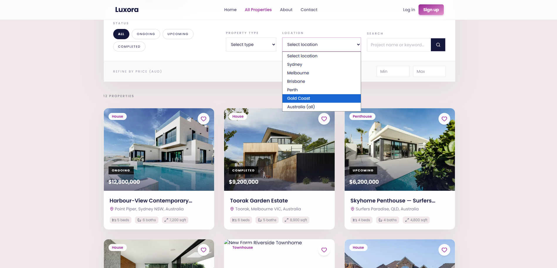
- ✓Search module with filters (including price band and property type) for serious shortlisting
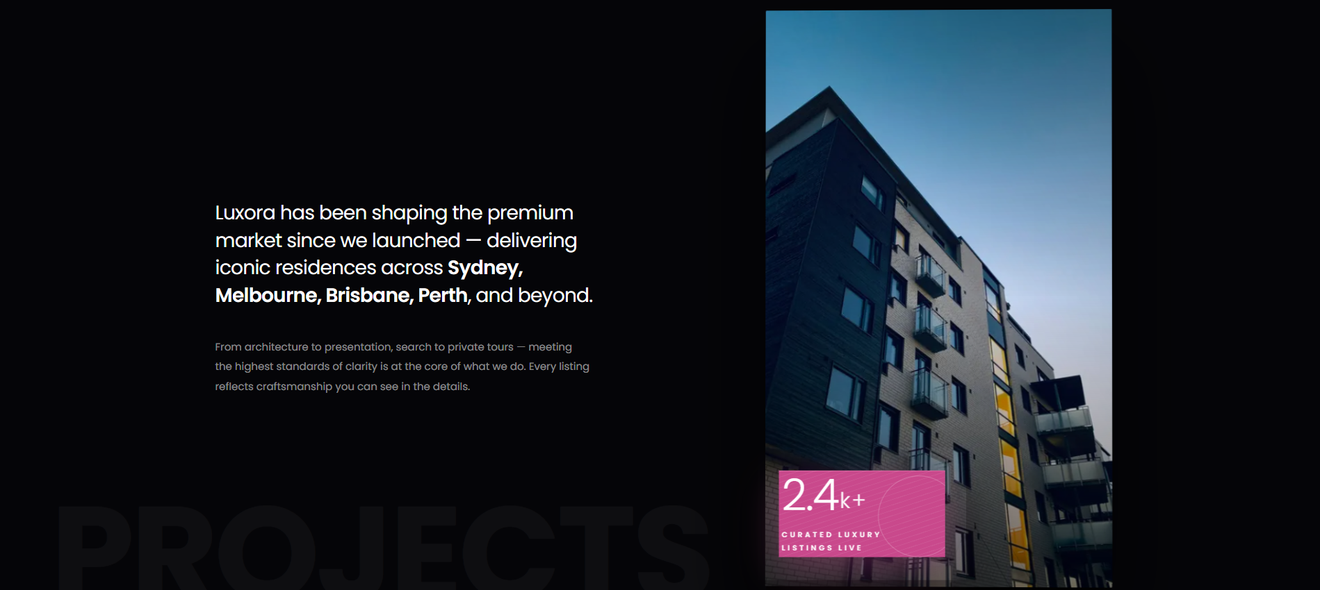
- ✓Editorial “Projects” narrative: scale, geography, and craftsmanship framing, not raw counts alone
- ✓Animated / scrolling values band reinforcing passion, presentation, and advisor-led service
- ✓“Latest launches” grid: card-based listings with photography-forward presentation
- ✓Three-step “How it works”: brief → compare with clarity → tour / callback when ready
- ✓“Land & lifestyle” regions: Sydney, Melbourne, Queensland coast, Perth & west, etc.
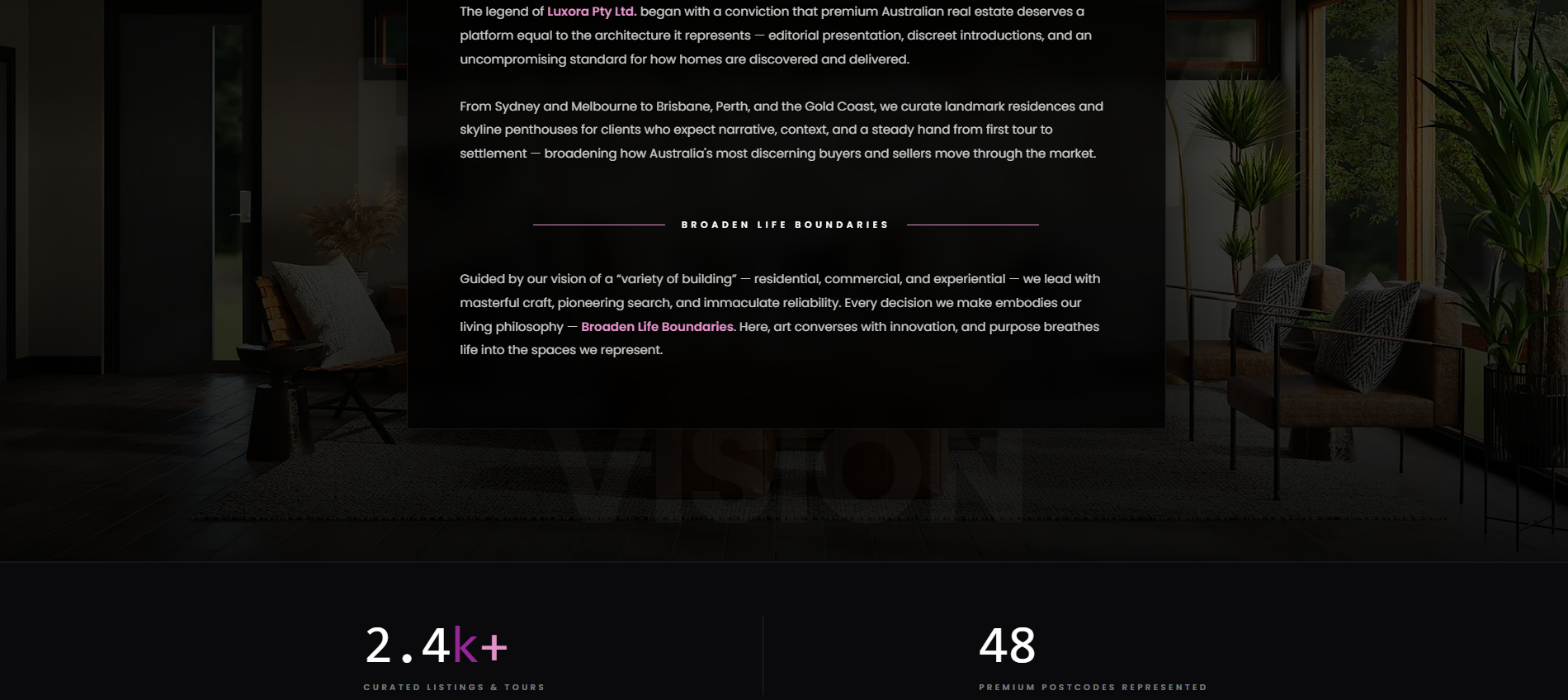
- ✓Metrics strip (listings, cities, response time, satisfaction, tours) for trust at a glance
- ✓Testimonials: multi-quote layout with city/state context for believability
- ✓Footer architecture: explore links, account paths, hotline, and dual CTA (contact + browse)
- ✓Mobile-first layout rhythm: readable type, comfortable tap targets, and stable imagery
- ✓Live deployment for stakeholder review: https://luxora-henna.vercel.app/
Project gallery
Walkthrough of key screens and product moments — from first impression through core workflows, proof, and conversion paths.
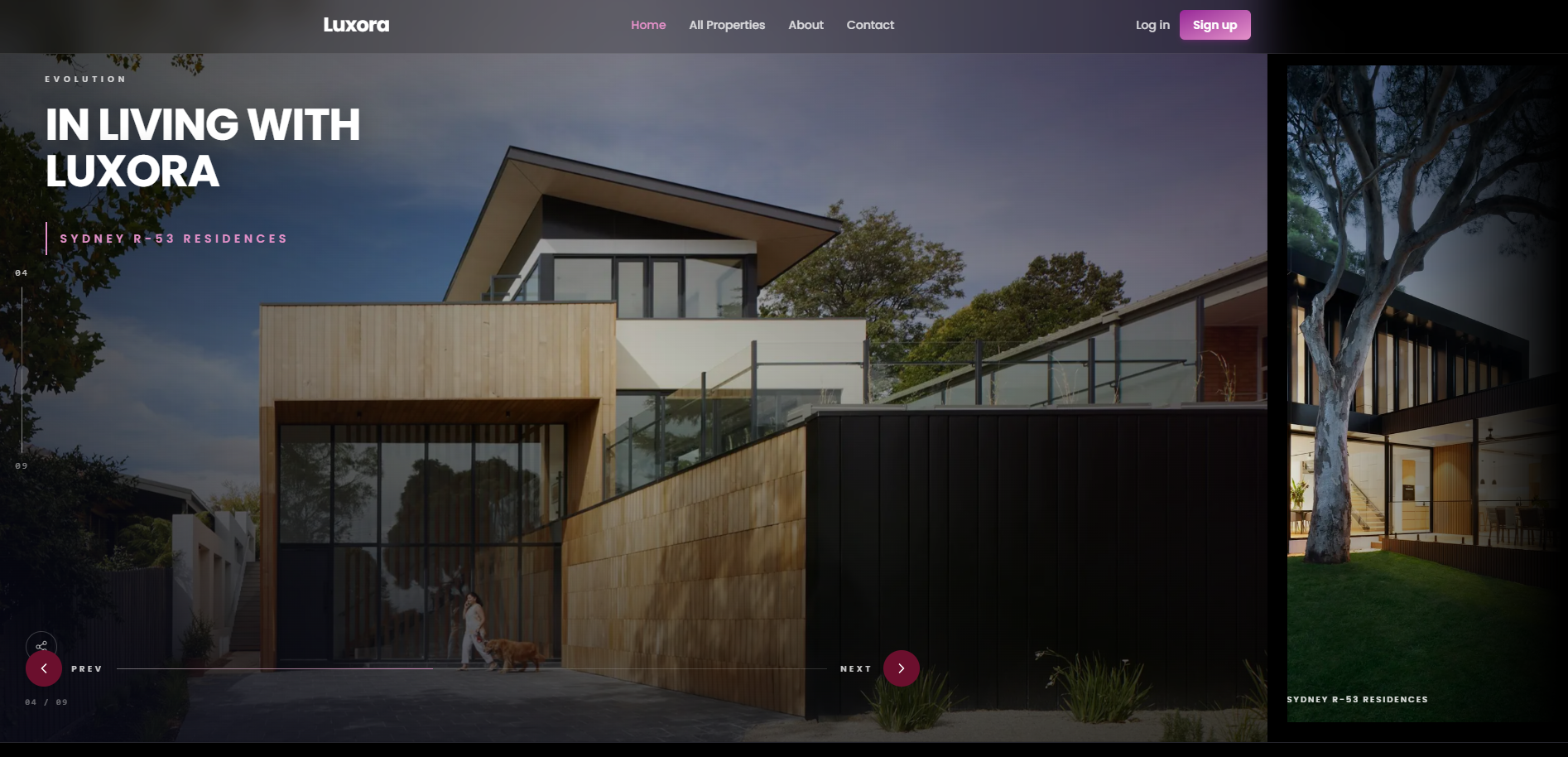
Hero & first impression, flagship property framing, headline, and premium visual tone.
Primary navigation and account entry, quick paths to listings, about, and contact.
Interactive property spotlight, exploration cues (drag / swipe) and carousel context.
Search and discovery controls, query entry plus access to deeper filters (price & type).
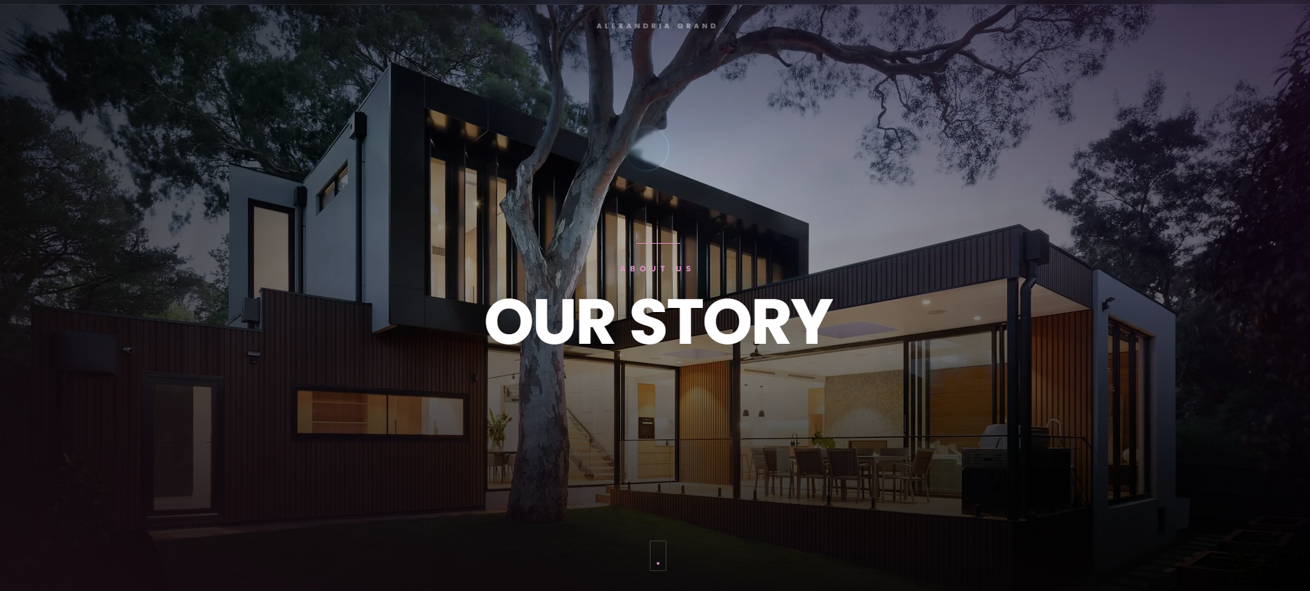
Brand narrative & scale, editorial copy on how Luxora curates the premium market.
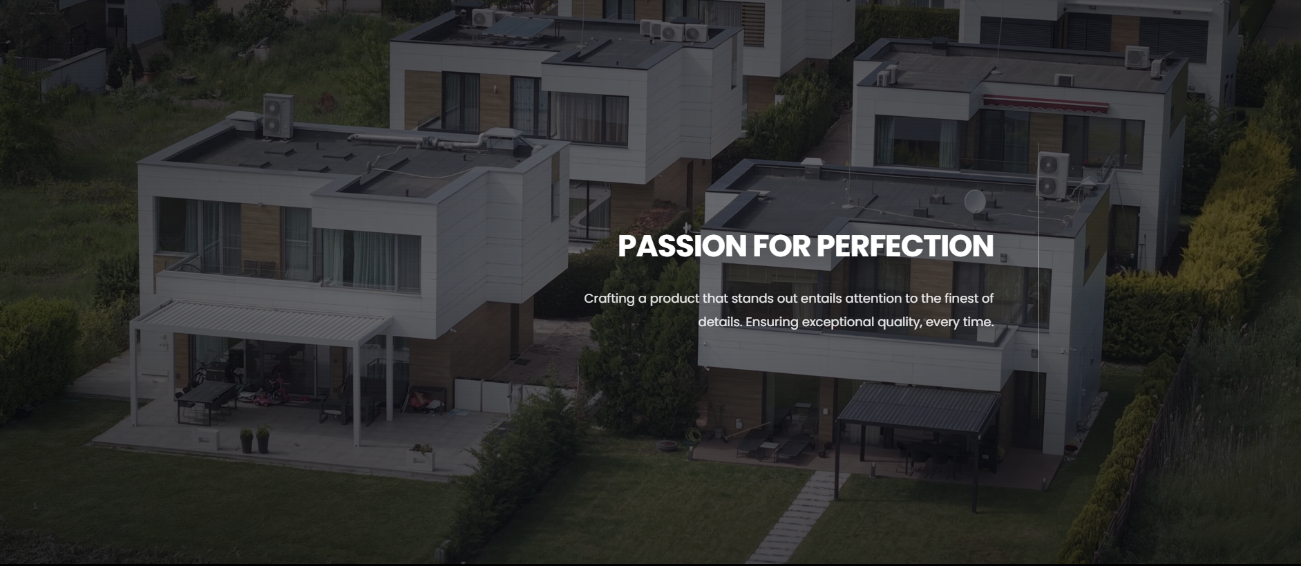
Values in motion, repeating mission language that reinforces positioning without cluttering the UI.
Latest launches grid, new and standout homes presented as polished, tour-ready cards.
How it works, numbered steps from brief definition to comparison to private tour / callback.
Land & lifestyle regions, geography-led modules for Sydney, Melbourne, Queensland, Perth, and beyond.
Proof & performance metrics, curated listings, cities represented, response benchmarks, satisfaction.
Testimonials, hotline, and footer, client quotes with location context, contact strip, and structured links to explore listings or reach an advisor.
Have a similar project?
We’d love to hear about your goals. Book a free call and we’ll outline options and next steps.
Get in touch